

 New Website, Same Curiosity
It was time for a change again. My successful personal website www.greg.ch, now in version 10, began in 1999, right in the middle of the first internet boom. I gave versions 1 through 9 very different designs – each creative and imaginative.
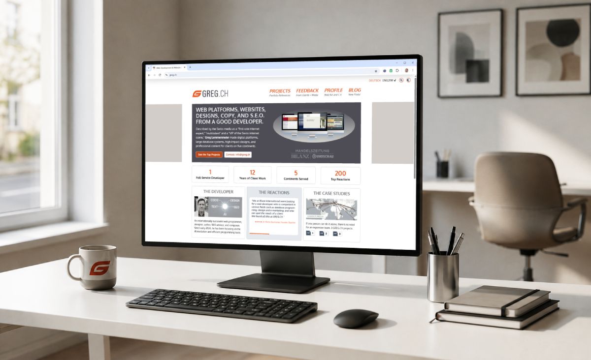
For version 10, I built an informative website without too many bells and whistles: the homepage gets straight to the point, showcasing websites I have developed, my skills, feedback, and client locations (on a world map) – all on one page.
A modern website needs to get to the point quickly and concisely. And answer questions visitors have. In 20 seconds or less. Otherwise, they are gone.
1.) Layouts and Typography
I optimized the layouts throughout the site and added more white space overall. My website does not stretch across the full screen, because I do not want visitors constantly looking from the far left to the far right – an unfortunate standard these days. A user-friendly site is compact, clearly organized, and visually easy to navigate.Web design trends in 2026 clearly favor a consistent pattern that has proven effective with users: a simple logo at the top left, a large headline below it summing up the offering, followed by 2 CTA (call-to-action) buttons, gradients in backgrounds and headings, cards with rounded corners, animated counter pills, 3 columns, plenty of CSS slide-ins, highly readable fonts, etc.
Across the web, many new sites feature black or sand-colored backgrounds, plenty of animation, and page elements flying in from all directions. All of it is supposed to look cool. Almost everything moves — the idea is to surprise. But: our hectic world is already overloaded with stimuli. Advertising and visual effects bombard us everywhere. And more and more older people are using the internet. What are they supposed to make of this circus? I do not chase every trend — never have. I study them, but only adopt what seems useful and tolerable. By the third visit, an excess of website effects is simply annoying. What I do NOT do: This sort of thing . Modern web design?
 . Modern web design?
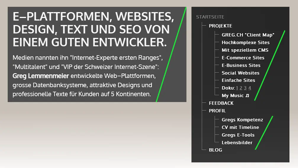
For the typography, I chose the "Oxygen" font at weight 400 for body copy and 700 for headings. The typeface feels clean and contemporary. Its open letterforms ("open counters") and monolinear structure (uniform stroke widths) give it a light, airy appearance even on smaller screens.
Sometimes, getting the typography just right means refining the wording until everything falls into place:
2.) Mobile Layouts
Starting with mobile devices, I used responsive web design to develop new, compact layouts for small screens.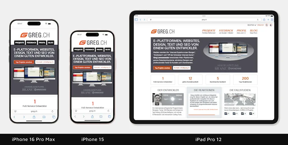
3.) Dark Mode
My website now has a "Dark Mode" (a darker color scheme), with a theme toggle on desktop computers. This is something many users now want. Dark mode uses a different palette: the energetic orange, for example, becomes a pleasant light brown. I had to adapt several images to work on dark backgrounds.
4.) Print Design
Since some users still want to print a web page (yes, really!), I developed a print design for every type of page. It produces clean page breaks, with no cropped images or content blocks split in two. Elements that serve no purpose in print, such as menus, are filtered out. Special page elements, including typing effects, CSS slide-ins, and "Masonry" layouts, needed separate adaptations. The result: printouts you can actually use.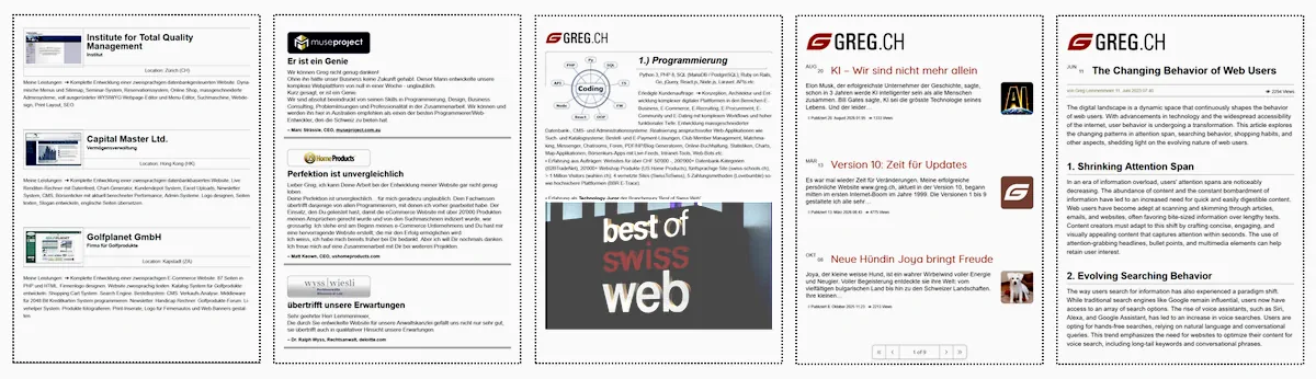
5.) Performance
Fact: a homepage can never really load fast enough, because web users have less and less patience. So I used specific techniques to improve my homepage loading time and added a footer displaying the results of the standard Google quality tests ("PageSpeed Insights"). As you would expect from me: 4 x 100%. My homepage loads in just 0.5 seconds.For comparison, here is the most important website in Switzerland www.admin.ch
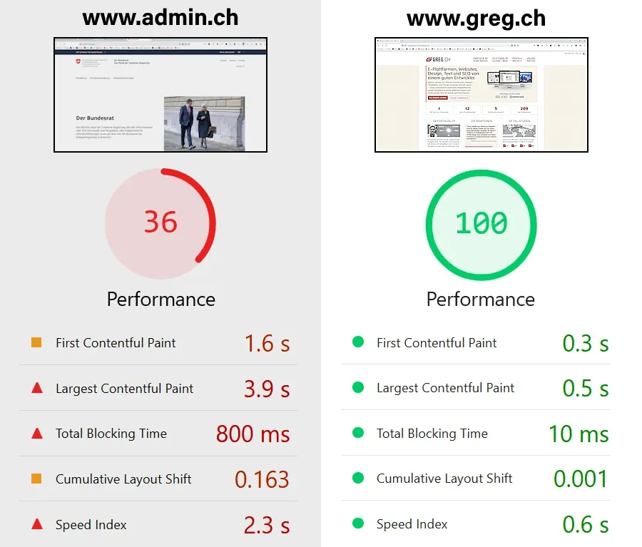
According to httparchive.org, homepages currently have an average total file size of 2'994 KB. Mine is just 370 KB. My website consists of just one PHP file, one CSS file, and one JS file. Plus assets such as images. I like things extremely compact and fast.
6.) Interface Details
You can recognize good web designers by the details — especially the usability. In other words, they care about their users! For example:• My language toggle makes it clear to every user which language is selected
• My menu items have subtitles, so visitors understand what they are clicking
• The feedback box uses an orange "progress bar" to show how much time remains
• One page features several subheadings that I designed with a subtle 3D effect

My page footer includes a sitemap so users can click straight through to another page instead of first scrolling back to the top menu. On some sites, I solved this with a "sticky" top menu, which has its pros and cons.

7.) Website Search
The search function on GREG.CH delivers relevant results in a flash as you type — thanks to "AJAX" and live search, with no page reload required. It searches database content and static website pages simultaneously. Blog posts, projects, feedback, and personal content are all easy to find through a single search field. The compact layout displays results right where you are and clearly labels which section they come from. My music is included, too: clicking a matching track opens the music page in a new tab, taking you straight to that piece.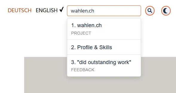
8.) Website Security
My client projects include high-security websites, for which I programmed features such as a USB dongle for user login (bbretrace.com). Or server-side protection for confidential bridge construction files. Or web-to-SMS messaging to verify the phone number of a new member. Website security has never been more important, because AI is driving a dramatic increase in the number and frequency of hacking attacks online.My website search uses preconfigured database queries known as prepared statements. These keep SQL commands separate from the search terms users enter. Even input that looks like a database command is treated as harmless search text. Search query length and the number of results returned are also limited. Clear rules apply to how results are displayed, too: titles are output as text. Any HTML tags or JavaScript instructions they contain are not executed as code. Result links are also checked to ensure they point to my own website. These measures protect my site against common attempts at manipulation, such as SQL injection and cross-site scripting.
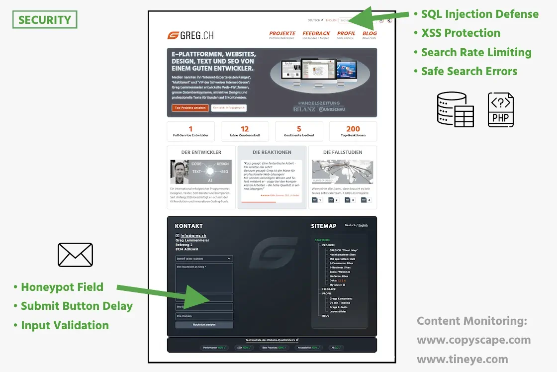
Server-side rate limiting for search requests is another important safeguard. It takes both individual IP addresses and the overall search load into account. Short bursts of input are allowed, while sustained automated barrages are stopped. The check happens before a database connection is even established. Deleting cookies does not reset this limit.
My contact form works without image puzzles or CAPTCHAs. Instead, it includes a so-called "honeypot": an extra field that is invisible to visitors and should remain empty. Spambots usually fill in every form field they find. If they enter anything there too, the server-side check detects it and blocks the message from being sent. Another hurdle is built into the submit button: it only becomes active after ten seconds. Anyone choosing a subject and composing a message will never notice. But those annoying spambots that fill everything in and click "Send" immediately after the page loads run into an obstacle.
I always keep my website's PHP version up to date — currently version 8.5. Regular updates and a version that still receives security fixes are essential for security. Yet PHP still has a bad reputation among some developers: mention in a coding forum that you use it, and you may get a condescending smile. Modern web applications, they insist, should be built with Python, Ruby on Rails or Go. Yet PHP still powers around 69% of websites whose server-side programming language is known. It underpins WordPress, Drupal and MediaWiki, the software behind Wikipedia. WordPress alone — another frequent target of criticism — powers around 40% of all websites (I would never use WordPress). PHP itself has evolved considerably — with a powerful type system, modern syntax and significantly improved performance. What's outdated is its reputation.
9.) SEO
I updated the search engine optimization of my website. Theindex.php file has a solid SEO structure: dynamic titles and descriptions, canonical, hreflang (de/en/x-default), appropriate robots directives, and JSON-LD are all in place. The Google sitemap is generated from the database via sitemap.php and provides lastmod, changefreq, priorities, and language alternatives for Google. The robots.txt file is decidedly Google-friendly, blocking only irrelevant areas (such as admin sections and filter URLs) and correctly referencing the sitemap. In .htaccess, 301 canonical redirects, sitemap rewriting, and caching rules provide a modern foundation, bringing the SEO up to date and keeping it Google-friendly.10.) Logo Redesign
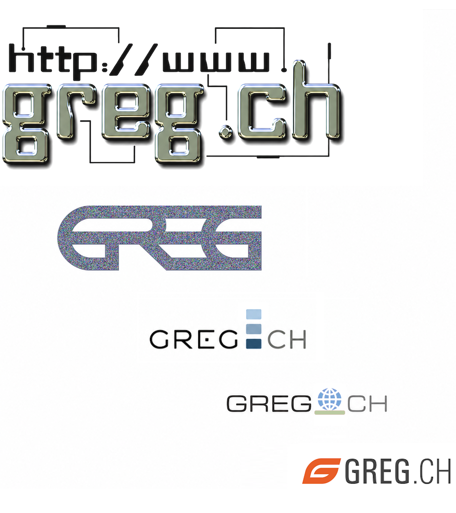
Here you can see how my website logo evolved from 1999 to 2026. I started designing when complexity was cool — and eventually arrived at simplicity. Today, most people prefer minimalist logos.I modernized the logo with a dynamic "G" as its symbol.

(my workstation for programming + design + copywriting + composing)
11.) AI - My Take

Arguably the most important topic of all is artificial intelligence www.greg.ch/ai
12.) Feedback Page

Since my work has generated so much feedback, this page needed a refresh, too. It now has better typography and an improved layout www.greg.ch/reactions
13.) Projects Page

I used to list some client projects under "Social Networks". But what I actually developed were "Social Websites" (mainly online platforms for clubs and dating). So I changed the category .
14.) Skills Page

My skills overview used to be unclear because very different disciplines, such as web development and trading, looked the same. I have now given the graphics distinct designs .
15.) Client Logos

Client logos from my portfolio are now organized on an A4 sheet , ready to print.
16.) Photo Page

I gave my photo page www.greg.ch/photos consistent formatting and arranged the pictures chronologically. As the son of a former professional photographer, I added a black-and-white effect. This page shows that I do more than sit in front of a computer all day.
17.) Music Page

For my music page www.greg.ch/music , I redesigned 4 CD covers (I made 8 CDs).
18.) Doggy Page

Since I have a new dog, there is now a new doggy page: www.greg.ch/joya
19.) SWB

I tightened up my older but widely read newspaper article "Swiss Webdesign Business" (surely more than 300k views to date — including print readers); it is now more compact.
18.) Project HeartOpera
For a personal web project by a neurologist (a medical doctor) in Zurich, I built a complete bilingual website. This included PHP8 programming, JavaScript coding, HTML and CSS, all new designs and layouts, some video and audio editing, and parts of the German and English copy.
The website focuses on contemporary performance art and experimental music connected with the Zurich University of the Arts (zhdk.ch). I therefore developed a clean, modern website design. The main priority was to keep anything from distracting from the featured performances.
- I began by developing the name: it had to fit the subject, be unique, and still be available as a web domain. My best idea was "HeartOpera", because the doctor is involved in both medicine and opera.
- Second, I developed the logo. This also had to be unique and convey both core themes. On one side, medicine: the heart as the most vital organ ➾ pulse ➾ ECG. On the other, opera ➾ grand entrances, drama, glamour ➾ a big, glamorous "O". To bring the logo to life, I designed a short animation that plays once with each page change:

- Third, I worked on the content: the website currently features 18 different projects — mainly public performances. Each project includes multimedia content (video or audio), for which I edited and cut several videos and audio clips. Every project also has bilingual text, which involved translating between German and English.
- Fourth, I explored ideas for the homepage (the starting page), combined several video scenes into a "teaser", and wrote introductory copy that captures the range of work on the site.
- Fifth, I developed a website design suited to contemporary art, created all the layouts, and chose the typography (typefaces and how they are displayed).
- After that, only the details remained: coding the responsive design for mobile devices such as smartphones, optimizing loading times, and so on.
- The finished website: www.heartopera.ch
Reflections
After a 15-year break from working on the web (as a programmer + designer + copywriter), I am once again fascinated by its new possibilities and technologies. My appetite for experimentation is back, and I am playing with ideas.As the son of a successful business consultant Swisscoaching and the brother of an independent software expert and IT support specialist MacSimum Support , I know that working for yourself is a challenge. In 2011, I stepped away to focus on more important things.
Sometimes I miss the old days. Back then, what feels like 100 years ago, I was an internationally successful web designer with clients on five continents and 12 television appearances — on SRF1 and 3sat, including reruns. Or the time the Brazilian broadcaster "TV Cultura" (70 million viewers) featured greg.ch as its website of the month — and my inbox promptly exploded. Or when the business magazine "Bilanz" put me on its list of Swiss "Internet VIPs" — and expectations kept climbing...
Yet I was just 1 guy with 1 PC and 1 coffee machine.
No certificates, no courses, no textbooks, no outsourcing, and no advertising. I didn't need any of that.
One Question Remains:
"Why do the vast majority of web designers fail to generate a response?"
Many build themselves a pretty homepage: flawless copy, clean layouts, modern effects. All nice. Then what happens? Nothing. Barely a ripple, hardly a reaction — let alone from international visitors or the media. The reason has nothing to do with JavaScript, Photoshop, or any technical know-how. It goes deeper: understanding people, psychology, and the ability to spark curiosity.
Around the turn of the millennium, plenty of technically primitive, sometimes downright awful websites still generated an enormous response. Why? Because they were psychologically clever. They tapped into the age-old human urge to discover. You kept clicking because you wanted to know what was behind the next door. You stayed because a sense of anticipation was building. This curiosity runs deep within us. All animals have it — and that includes us. I play hide-and-seek with my young dog every day; she loves it...
Here is how it began:
In 1999, I visited a simple website called "Stoked" by Derek Powazek. Technically, it was nothing spectacular. But it fascinated me because it tapped into that urge to discover. It sparked my curiosity. It drew me in. So I built my first homepage. And www.greg.ch generated — bingo! — a response.
How people think and react — I already had a pretty good grasp of that. Not from a psychology degree, but from my previous career: 16 years in the financial markets.
I had not chosen that industry because trading millions in seconds seemed especially cool. Something else interested me: human psychology. For example, I worked at the largest brokerage firm in the world, where I witnessed the full human drama of the stock market: curiosity, hope, anticipation, reward, greed, loss, panic, despair!
Everything was constantly in motion. Euphoria in the morning, fear in the afternoon, a crash just before the closing bell. At Merrill Lynch, we had clients who took their own lives after losing everything in the stock market. And junior traders who drove Ferraris at 22 and showed up with girlfriends who were models. Our big boss was Marcel Ospel, who later headed the largest Swiss bank. Our head trader was Sergio Ermotti, who runs it today. The Merrill Lynch motto was: "A Breed Apart"...
Really? Really.
Ultimately, it was all about performance and the ambition to be better. Mistakes were forbidden.
Every day, I saw how extreme human reactions can become under pressure. One colleague was clearly on cocaine, another on heroin. Staff turnover was enormous. Many lasted only a few weeks before reaching their breaking point. Too much stress, too many lines like "Lunch is for Losers", too many four-letter words.
During those years, I learned more about people than any course could have taught me. And that knowledge later helped me in web design more than any software skills. A website does not make an impact simply because it is technically or aesthetically perfect. It makes an impact when it builds anticipation, sparks curiosity, and makes people want to keep clicking. Understanding human behavior, emotions, and instincts is essential to generating a response.
For my second television profile, Reto Brennwald — known as the most critical TV host in Switzerland — filmed me in a gold-colored Rolls-Royce. A perfect fit for my former career as a gold trader. But moving into the internet industry was the right decision: what began with "Stoked" opened up entirely new worlds of experience — and I am grateful for that.
Now I look after my dog, spend hours every day out in beautiful nature, and take deep breaths. What a simple life! I am 63 and still have no gray hair. Apparently, stress keeps you young.

```
Posted on 13. March 2026 at 08:43 👁 6362 Views ≡ Category: Web Development
© Greg Lemmenmeier, Rebweg 2, CH-8134 Adliswil — WEB www.greg.ch | EMAIL info@greg.ch
